13 Oct 2020 | Accessibility


Have you ever had to strain to read the text on a website because it is indistinguishable or unclear from the background it is on? If you’re a digital manager, have you ever received feedback that this is a problem on your website? The contrast between different colours is a significant issue for many users and for digital teams; it is also addressed in the WCAG 2.0 and 2.1 accessibility guidelines so needs to be managed for compliance reasons. The ability for users to successfully read text is impacted not only by the contrast between the colour of the text and the background but also by the size of that text too, a factor taken into account when considering colour contrast in the WCAG guidelines.
In this article we’re going to explore why colour contrast is a significant issue when presenting text on your website and also how you can use automation to help you better manage it.
Why is colour contrast an issue?
Colour contrast is a significant accessibility issue, but it is also a wider usability issue. The contrast between colours on your website impacts the ability of users to perceive text when it is on some kind of colour background or image. It can also impact their ability to spot elements such as a button to click or areas on a form. If a colour contrast is not right, a user:
- may not be able to read text or distinguish different elements, making a page or part of a page redundant;
- may misread text leading to errors or in them getting the wrong information completely, which can have varying consequences;
- may have to strain their eyes to read text, leading to an uncomfortable and frustrating experience.
Colour contrast is more widespread an issue than many teams consider, for three main reasons:
- There is often a significant amount of text on coloured backgrounds.
- There are a higher number of users with colour vision deficiencies and related issues.
- There are lighting conditions where colour contrast can impact all users.
Significant amounts of text need to be considered for colour contrast
On any website there will be a significant amount of text that is not standard black text on a white background. Any text overlaid on an image, any text on buttons and navigation menus, any text on hero banners, on promotional boxes and content spotlight features; all of these are areas where colour contrast comes into play. Web designers often have aesthetics and brand considerations in mind above accessibility.
High number of users with issues
The number of users who have some kind of colour visual deficiency is surprisingly high; in the UK around 1 in 12 men and 1 in 200 women have an issue. Within this number are different types of colour vision deficiency, relating to reduced sensitivity to different colours. Additionally, other wider groups are more susceptible too; for example, as we grow older our ability to distinguish between colours can diminish and website colour contrasts can become more of an issue.
Intense and dim light
For everybody, colour contrast becomes more of an issue in scenarios in dim and intense light. As more and more of our online behaviour is delivered through mobile devices, trying to view web content in the glinting sun or in a room with subdued lighting can become increasingly difficult.
Why is colour contrast difficult to manage?
For digital teams and website managers managing colour contrast is important, for a number of reasons:
- Because there are high number of users with potential issues.
- Because it can mean vital information or elements on your website are missed, including a call to action button, for example.
- Because it is often part of accessibility compliance, being part of the WCAG accessibility standards
But it’s also one of those areas which has its challenges to manage. There are a variety of different reasons for this, but they include:
- Web designs and colour palettes are not always defined with accessibility in mind and there can be a conflict between aesthetics and accessibility (although there does not need to be!).
- Decentralised content management means that individual content owners may be responsible for their own pages and will not be aware of colour contrast issues.
- Content management systems may automate text overlay on different backgrounds for hero areas or content spotlights across more than one page, making it hard to track if there are issues.
- In general content management systems do not spot any potential colour contrast issues.
- Images can be brought in from third parties that will not have been checked for colour contrast.
Using automation: how Sitemorse tracks colour contrast issues
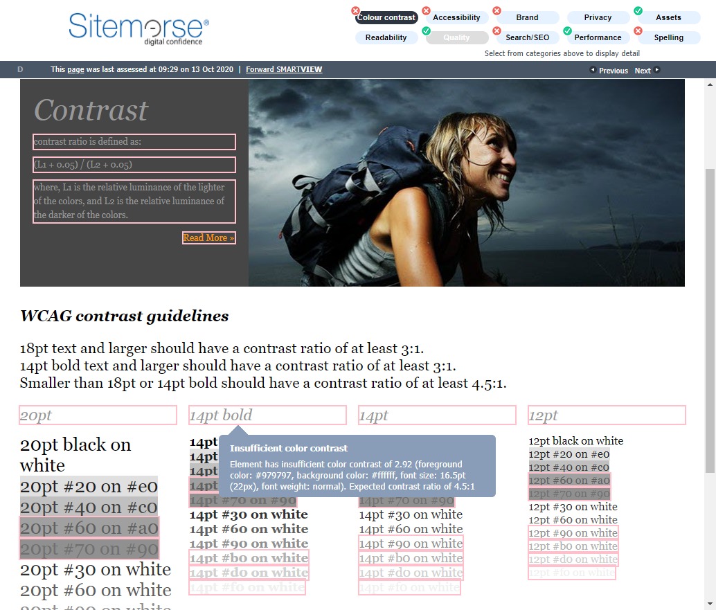
Automation can help you spot and rectify colour contrast issues, with an algorithm comparing colours of text and website elements with backgrounds. Note that automation cannot solve every problem here, particularly when there is an image involved which has text overlaid.
You can now use Sitemorse to track colour contrast issues at the page level. We’ve incorporated it into SMARTVIEW, our handy browser plug-in that can remotely and instantly identify issues on any web page covering accessibility, links, SEO, code quality and more. If there is a potential colour contrast issue that impacts compliance with the WCAG guidelines or your user’s ability to view the site, that area is highlighted. You can then easily access more detail to get the full technical diagnostic if needed.
All you need to do is visit the page, operate SMARTVIEW there and then, and make any necessary adjustments. This makes it an ideal check for content owners to carry out either before or just after they have published a page.
We have taken this page-level approach because:
- Colour contrast issues often happen on a page-by-page level.
- Using SMARTVIEW empowers individual page owners to fix the issue, also helping drive awareness of colour contrast issues across your publishing community.
- The ability to instantly track colour contrast issues when pages are being created or reviewed and then fix them at that time is often the best way to keep on top of it, supporting our mission to make compliance achievable.
Making compliance achievable
Colour contrast is important for your visitors and for accessibility compliance, but it can be challenging to manage. Using the automation of a product like Sitemorse to spot issues at the individual page level can help you keep on top of any colour contrast issues and ultimately make compliance achievable.