21 Sep 2016


Sitemorse are undoubtedly the longest established digital governance provider. Often we hear about users reacting to what feels like endless pages of a report which itemises the issues that are occurring in no particular order, but this is where Sitemorse is different. At Sitemorse we are aware that digital teams want to achieve something with the changes they are making, simply they want to see improvements rather than reports.
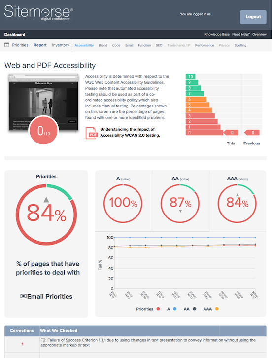
To help digital teams make these improvements Sitemorse developed a practical and pragmatic way to deal with any issues that have been highlighted, “Priorities”. Priorities was launched three years ago covering Accessibility, Brand and other areas. It soon highlighted that Accessibility was one of the key areas that needed to be looked at and that it was an area that most people spent the majority of their time trying to improve. Since then priorities have been evolving, with the latest update to the Accessibility Page which launched in September.
The Accessibility page will now make improving accessibility even easier. The page now shows how a site is performing regarding accessibility in simple, easy to read graphics. The graphics show how many pages fail accessibility by A, AA & AAA standards. There is also the option to see more in depth information about where the failures are and what category they fall into. In addition to this, there is a useful graph which shows how the site has performed over time so that improvements can be tracked.
Crucially, Sitemorse have also changed the way priorities are viewed. The top 10 priorities which Sitemorse amalgamated earlier this quarter are now shown on the page, along with how many corrections are required for each priority. From here, users can drill down further into the priorities to see where the corrections are required. Along with this, there is also a graphic which shows how many pages in percentage terms have priorities that need to be dealt with, giving digital teams an idea of much work they have ahead of them.
The most unique and one of the most useful additions to this page though is the ability to email priorities. Within just the click of a button the priorities can be emailed to anybody regardless of whether they have a Sitemorse log in. The recipient can view and take action on these priorities make improvements faster.